


Project Overview
During the Google UX Design Certificate course, participants are assigned an app design challenge through a challenge generator. My challenge was to “design a customer loyalty app for a food truck in California.” I decided to make an app for Marshawarma, a food truck specializing in Marshmallow desserts. This may sound like a “highdea”, but I just really love marshmallows and wanted to throw this idea to the universe and maybe one day Marshawarma will be realized.
Research
I conducted user interviews and competitive analysis to discover user behaviors and needs as well as what products and features are already available to people.
User Interviews & Insights
I surveyed a group consisting of five females and two males for a total of seven interviewees. I interviewed each participant individually, asking open-ended questions about their general app usage, experiences with food ordering apps, and experiences at food trucks.
Overall participants indicated they would prefer not to have an app for a singular restaurant, but would be more interested in one app for many restaurants with a reward system. A few particularly expressed a need for accurate locations and operational hours for food trucks. The Google UX Design course explicitly states not to deviate from the given app topic, so even if the overall concept of one app for a singular truck may not be viable, exploring features for an app with a wider scope while designing for this project is something I kept in mind.
Competitive Analysis
When conducting competitive analysis, I found that there are no food truck apps for a singular food truck. I instead conducted reviews of three specialty dessert food truck’s websites and their mobile site designs/features. I also found an app that let’s users find food trucks, order from them, give them ratings, and share truck events with friends.
Paradise Cookies & Ice Cream
Strengths
- Navigation is simple and clear
- Call to action button is prominent
Weaknesses
- Menu is displayed by images and is consequently less accessible
- Favicon is unrefined
- Logo has small text with poor contrast
Hustle ‘n Dough
Strengths
- Clear and easy to find schedules and locations
- Easy to order ahead right from the site and mobile site
- Consistent and memorable branding
Weaknesses
- Due to poor contrast with background image some text is difficult to read and hamburger menu in mobile view is hard to see
- Swearing on site may put off certain groups of people
FK Frozen Kuhsterd
Strengths
- Unique take on frozen custard
- Smaller catering offerings that do not include the whole food truck
- Branded merch with a catchy slogan
Weaknesses
- No pricing for items on site
- Some parts of site have poor contrast and are hard to read
- Site and social media are still active, but no real updates made
Truckster
Strengths
- Map with dates & times
- Ratings and reviews of trucks
- Social media integrated
- Mobile ordering and filter trucks those with mobile ordering
Weaknesses
- Not many trucks have signed up to be on this platform
- Filter options on map are not easy to use or have a clear function
Prototyping
After reviewing the interviews and the resulting personas I established a list of features and functionalities that included mobile ordering, a map with date picking capabilities, and a stamp reward system. My research indicated that creating an enticing environment while keeping functionality clear and easy to use is very important.
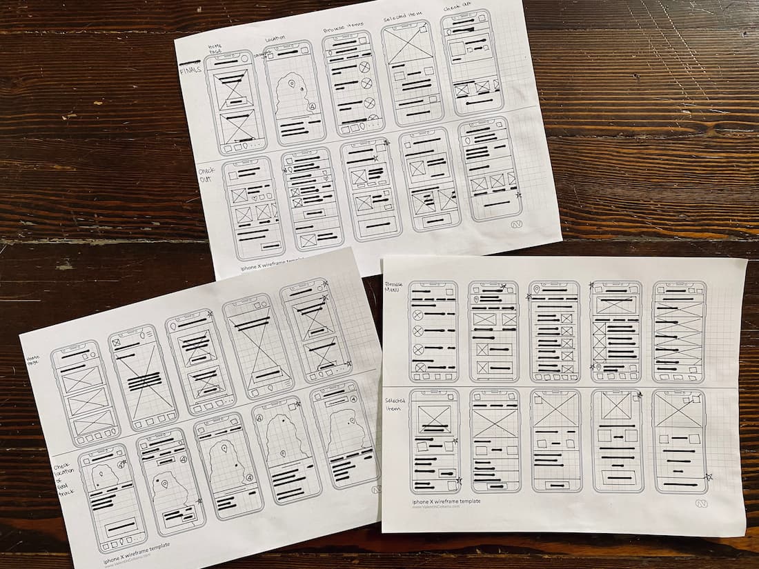
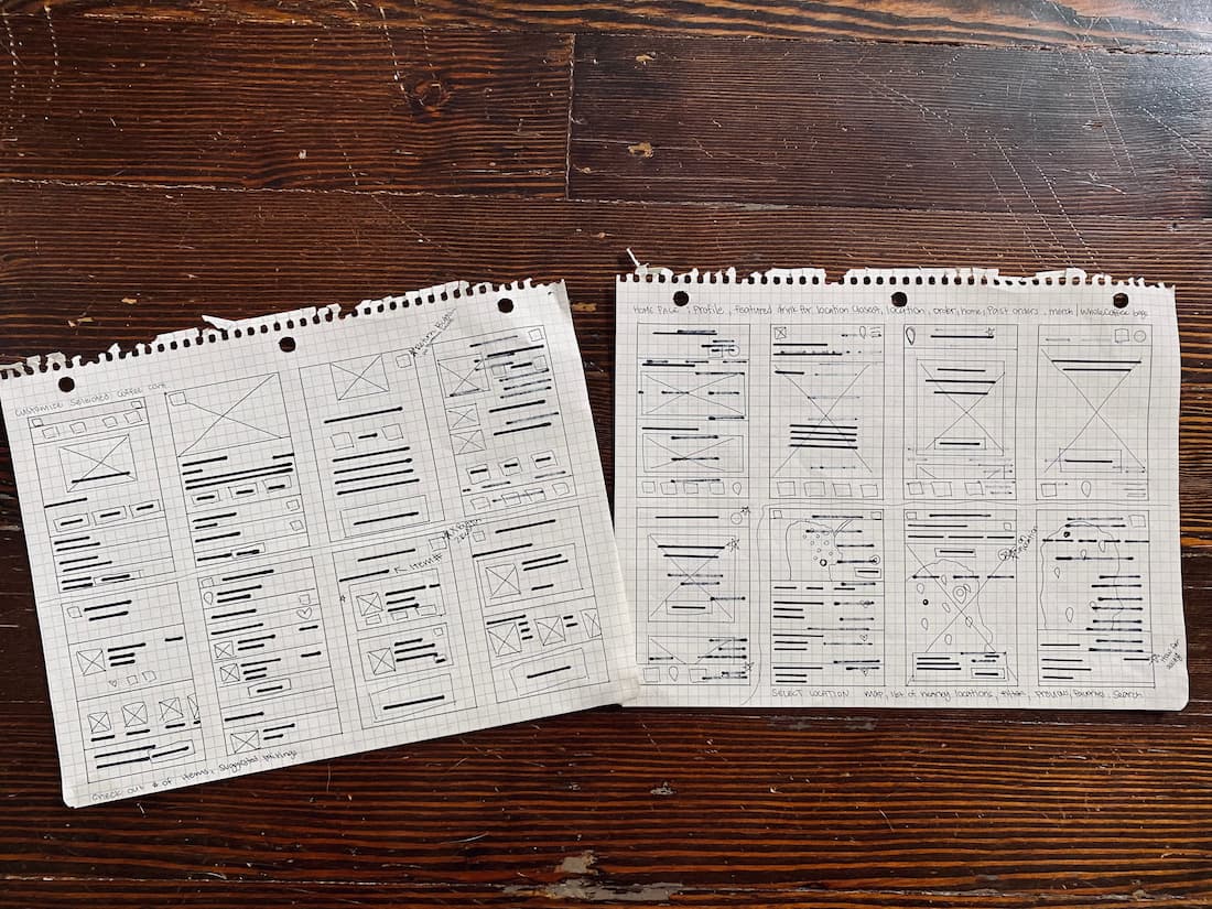
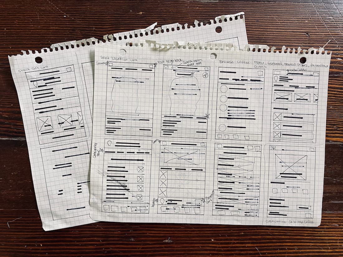
I then moved to Figma to develop a few screens as digital low fidelity prototypes.
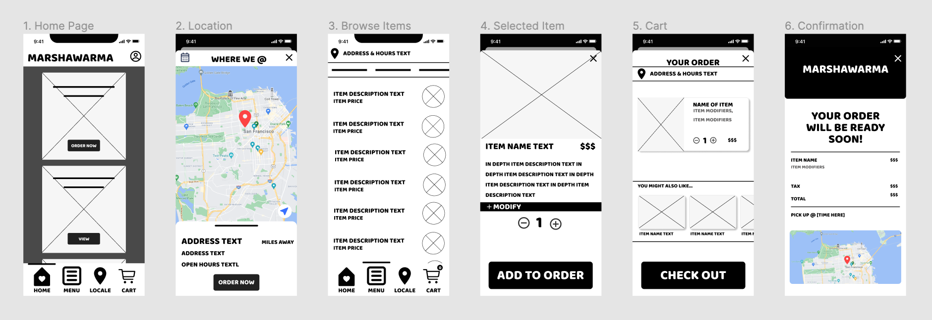
Eager to give this app some aesthetic life I obviously couldn’t help myself to picking a font and a few icons. I decided to take a deeper dive into design systems like Material Design and I also created a style guide for the Marshawarma app.

After completing my HiFi wireframes my prototype is ready to go!
Reflection
The process of completing my first project has given me practice with design thinking and invaluable experience with user interviews and prototyping. After getting feedback from peers and iterating on my final designs a few times I am satisfied with the end product. What I would do differently next time is choose a topic and research how viable the idea is before moving forward with the project. I enjoyed making a funky app for an imaginary food truck, but there really isn’t a need to have one whole app for a singular food truck.